Color and Finish Combinations for Cohesive Home Interiors
Choosing color and finish combinations helps tie a living area together by linking seating, furniture, textiles, and lighting into a coherent scheme. This short overview highlights how balanced palettes, complementary materials, and considered textures support practical needs like storage, acoustics, and ergonomics while preserving a comfortable visual flow.

A cohesive interior begins with a thoughtful approach to color and finishes that reaches beyond paint chips. Consider how seating fabrics, furniture finishes, and textiles interact with lighting and accessories to create a consistent atmosphere. Materials that repeat in small doses—such as a metal trim, wood tone, or a woven texture—can move the eye across a space and reinforce zoning decisions without overwhelming the room.
Seating and layout: how color guides arrangement
Seating choices set the emotional tone and visual weight of a room. Coordinate upholstery color and finish with the layout so larger pieces anchor the space while accent seating introduces contrast. Neutral base upholstery allows patterned cushions or textured textiles to add interest; conversely, a boldly colored sofa can be balanced by quieter surrounding furniture and consistent accessory metal finishes. Consider ergonomics when selecting seat dimensions and materials—comfortable depth and supportive cushions promote use while finishes that resist wear help maintain cohesion over time.
Furniture and materials: finish pairing strategies
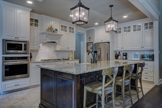
Select furniture finishes that speak to one another through tone and texture. For example, pairing a mid-tone wood table with a slightly warmer wood cabinetry finish creates subtle harmony; mixing in a cool metal or matte black can add modern contrast. Aim to repeat at least two materials across the room—such as wood and brass or glass and ceramic—so the eye recognizes a deliberate palette. Also think about maintenance: sealed woods and powder-coated metals will age differently, so choose complementary finishes that remain attractive as they wear.
Lighting and color: balancing warmth and tone
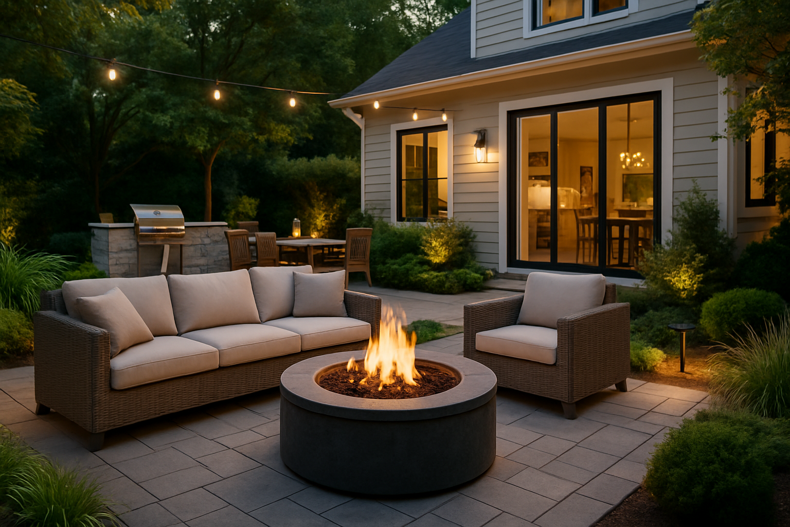
Lighting profoundly affects how colors and finishes read. Warm light softens cool grays and highlights wood grains; cooler light keeps whites crisp and accentuates modern materials. Layer ambient, task, and accent lighting to preserve the intended color balance throughout the day. Position lighting to reveal textile textures and the sheen of finishes—matte materials reduce glare, while satin or lacquered surfaces reflect more light and can act as visual highlights within a cohesive scheme.
Textiles and accessories: texture for cohesion
Textiles—rugs, curtains, cushions—are an efficient way to introduce colors and tactile contrast without committing to permanent finishes. Select a palette for large textiles and echo smaller accent colors in accessories to create repetition. Accessories in similar materials or finishes, such as ceramic vases or metal frames, reinforce the scheme; layered textures (nubby wool, smooth linen, and a woven rug) provide depth and help manage acoustics by absorbing sound. Keep accessory scale proportional to your layout so items feel intentional rather than scattered.
Storage, acoustics, and ergonomics: functional finishes
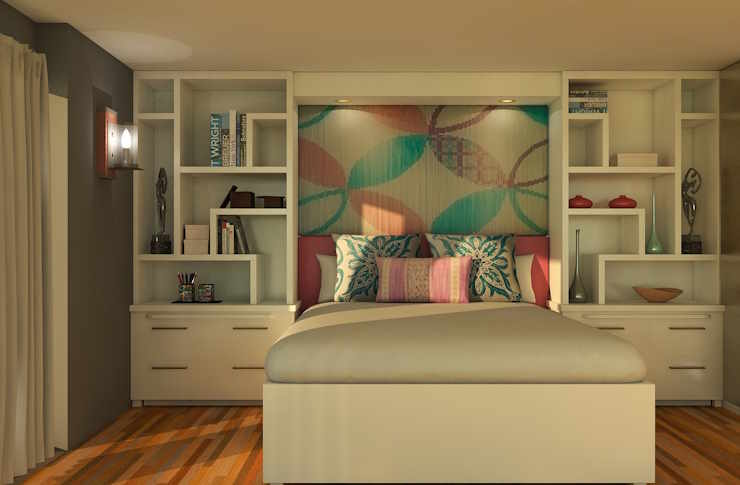
Finishes should support the way the room is used. Concealed storage with consistent panel finishes keeps clutter out of sight and maintains visual calm; open shelving can display curated objects that repeat colors and materials. Soft textiles, rugs, and upholstered panels improve acoustics, especially in larger, open-plan spaces. Ergonomics ties into finish choices too—rounded edges on tables, durable upholstery, and stable material pairings enhance usability and safety while preserving a unified look.
Zoning and flow: unifying palettes across spaces
Use color and finish variations to define zones while preserving flow between them. A consistent neutral base across adjoining spaces—walls or flooring—lets you use accent colors and finishes to delineate a seating area, a reading nook, or a media zone. Repeat a secondary finish, such as a brass detail or a particular wood grain, in multiple zones to create a visual thread. Consider sightlines and how natural and artificial light will shift colors as you move through the space to ensure transitions remain harmonious.
A cohesive interior arises from intentional repetition and balanced contrast: pick a modest palette, repeat key materials in measured doses, and layer textures and lighting to support both aesthetic and practical needs. Thoughtful decisions about seating, furniture finishes, textiles, storage, and ergonomics keep a space visually unified while accommodating daily life. When color and finishes work together, zoning, flow, and acoustics feel natural rather than forced, producing a durable and comfortable home environment.


